數位相簿很上手

1. 開發環境與工具

一、Gmail帳號

  1. 上課必須有一個Gmail帳號,老師上課會做螢幕錄影,影片上傳至雲端硬碟,下課後同學可以自行下載複習
  2. 申請Gmail

二、GitHub帳號

  1. GitHub 除了提供免費的 Git Server 外, 當做靜態檔案的伺服器。
  2. 每個帳號可以設定一個「github.io」的子網域,例 https://webugm.github.io/
  3. 官網:https://github.com/
  4. 註冊帳號
    註冊完成須至電子信箱收驗證信

三、建立專案(repository)

  1. 第一個專案名稱,建議「username.github.io」,
    如此設定的GitHub Pages的網址為「https://username.github.io/」,
    其它的專案則為「https://username.github.io/專案名稱
  2. 設定為GitHub Pages(username.github.io 專案預設已開啟GitHub Pages)
  3. 圖解:https://www.ugm.com.tw/modules/tad_book3/page.php?tbdsn=859
  4. 本期課程統一數據庫:tncomu

四、Git軟體

  1. 官網:https://git-scm.com/
  2. 下載:https://git-scm.com/download/win
  3. 在下載頁面,會自動偵測適合版本的安裝版,建議取消,改用「攜帶版」安裝
  4. 執行「PortableGit/git-bash.exe
  5. 設定Git config 環境
    git config --global user.name "tawan158"
    git config --global user.email "tawan158@ugm.com.tw"
    git config --global color.ui true
    git config --list
    請自行將紅字部份,換成自己的 GitHub帳號GitHub email
    每次第一次上傳時,GitHub會要求輸入「帳號」、「密碼」,如果在各位家裡的電腦,則是做過一次,就會記錄起來,不用每次輸入
    但教室電腦會還原,所以建議將替換過的指令,記鍵在Google文件中,方便下次設定使用
  6. 第一次「push」時,會要求「GitHub 帳號、密碼
  7. 我們是使用GitHub Pages服務,所以只會用Git的幾命令而已
    把遠端的專案下載至本地端,如果專案是要當網頁伺服器,建議先設定完「GitHub Pages」再「clone」
    cd /c/ugm/github」=> 改變目錄位置。藍字部份請用滑鼠拖曳
    git clone https://github.com/tawan158/tncomu.git」,只要是Git的命令前面都要加git, 藍字部份請至GitHub取得
      => clone之前,不能有「tncomu」資料夾,否則無法clone
  8. 「cd /c/ugm/github/tncomu」=>把目錄切換至「tncomu」,注意此時最右方應該會(master)
  9. 上傳檔案三個步驟
    git add .
    git commit -m "訊息"
    git push origin master

五、文字編輯器

  1. 32bit sublime text3
  2. 64bit sublime text3
  3. codepen

六、安裝免費樣板

  1. 範例:https://tawan158.github.io/

數位相簿很上手

1-1 GitHub Pages

GitHub Pages

  1. GitHub Pages是一個靜態站點託管服務。
  2. GitHub Pages旨在直接從GitHub存儲庫託管您的個人,組織或項目頁面。要詳細了解GitHub Pages網站的不同類型,請參閱“ 用戶,組織和項目頁面”
  3. 您可以使用Jekyll主題選擇器在線創建和發布GitHub頁面如果您更喜歡在本地工作,則可以使用GitHub Desktop命令行
  4. GitHub Pages是一個靜態站點託管服務,不支持服務器端代碼,例如PHP,Ruby或Python。


GitHub Pages網站受以下使用限制的限制:

數位相簿很上手

1-2 Git

  1. 因為 GitHub 最近剛改變他們的 SSL 連線參數設定,主要是 SSL 連線現在只提供 TLSv1.2 加密連線協定,還有停用 SHA1 雜湊演算法。
  2. 所以請重新下載最新版的Git軟體,請下載至 「c:\ugm\」下,然後對其按「右鍵/開啟」再按「ok」就可以自解壓縮了!
  3. 請執行「PortableGit/git-bash.exe」
  4. 設定 config
    git config --global user.name "tawan158"
    git config --global user.email "tawan158@ugm.com.tw"
    git config --global color.ui true
    請自行將紅字部份,換成自己的 GitHub帳號 與 email
    每次第一次上傳時,GitHub會要求輸入「帳號」、「密碼」,如果在各位家裡的電腦,則是做過一次,就會記錄起來,不用每次輸入
  5. 我們是使用GitHub Pages服務,所以只會用Git的幾命令而已
  6. 「cd /c/ugm/github」=> 改變目錄位置
  7. 「git clone https://github.com/tawan158/tawan158.github.io.git」=> clone之前,不能有「tawan158.github.io.git」資料夾,否則無法clone
  8. 「cd /c/ugm/github/tawan158.github.io」=>再把目錄切換至「tawan158.github.io」
  9. 上傳檔案三個步驟
    git add .
    git commit -m "訊息"
    git push origin master

數位相簿很上手

2. Bootstrap4 - 網格系統

一、簡介

  1. Bootstrap 是目前最流行的前端開發框架
  2. Bootstrap 是一個用於開發 HTML、CSS 和 JS 的開源工具包
  3. 世界上最受歡迎的前端元件庫,建立響應式、行動優先的專案。
  4. 官網:https://getbootstrap.com/
  5. 中文:http://bootstrap.hexschool.com/

二、CSS框架

  1. 單位:rem
  2. 佈局:flexbox
  3. 基礎: sass
  4. 基於 jQuery 開發的插件來 快速建構你的想法或是應用程式

三、安裝

  1. 下載Bootstrap至我們的專案並解壓縮:https://github.com/twbs/bootstrap/releases/download/v4.1.0/bootstrap-4.1.0-dist.zip
  2. 下載JQuery:https://code.jquery.com/jquery-3.3.1.min.js
  3. 下載Popper:https://cdnjs.cloudflare.com/ajax/libs/popper.js/1.12.9/umd/popper.min.js
  4. 套用
    將專案開啟至編輯器
    新增一個檔案:index.html
    注意js的順序 
    http://bootstrap.hexschool.com/docs/4.0/utilities/colors/
    <!DOCTYPE html>
    <html lang="zh-Hant-TW">
      <head>
        <!-- Required meta tags -->
        <meta charset="utf-8">
        <meta name="viewport" content="width=device-width, initial-scale=1, shrink-to-fit=no">
     
        <!-- Bootstrap CSS -->
        <link rel="stylesheet" href="css/bootstrap.min.css">
        
        <!-- jQuery first, then Popper.js, then Bootstrap JS -->
        <script src="js/jquery-3.3.1.min.js"></script>
        <script src="js/popper.min.js"></script>
        <script src="js/bootstrap.min.js"></script>
     
        <title>Bootstrap 離線版</title>
      </head>
      <body>
     
      </body>
    </html>
    請用開發人員工具「F12」=> Network 檢查 引入的Js、Css是否正確
  5. CDN套用
    新增一個檔案:cdn.html
    注意:這裡的jquery是瘦身版(不含ajax、動畫效果)
    <!doctype html>
    <html lang="zh-Hant-TW">
      <head>
        <!-- Required meta tags -->
        <meta charset="utf-8">
        <meta name="viewport" content="width=device-width, initial-scale=1, shrink-to-fit=no">
    
        <!-- Bootstrap CSS -->
        <link rel="stylesheet" href="https://stackpath.bootstrapcdn.com/bootstrap/4.1.0/css/bootstrap.min.css" integrity="sha384-9gVQ4dYFwwWSjIDZnLEWnxCjeSWFphJiwGPXr1jddIhOegiu1FwO5qRGvFXOdJZ4" crossorigin="anonymous">
    
        <title>Hello, world!</title>
      </head>
      <body>
        <h1>Hello, world!</h1>
    
        <!-- Optional JavaScript -->
        <!-- jQuery first, then Popper.js, then Bootstrap JS -->
        <script src="https://code.jquery.com/jquery-3.3.1.slim.min.js" integrity="sha384-q8i/X+965DzO0rT7abK41JStQIAqVgRVzpbzo5smXKp4YfRvH+8abtTE1Pi6jizo" crossorigin="anonymous"></script>
        <script src="https://cdnjs.cloudflare.com/ajax/libs/popper.js/1.14.0/umd/popper.min.js" integrity="sha384-cs/chFZiN24E4KMATLdqdvsezGxaGsi4hLGOzlXwp5UZB1LY//20VyM2taTB4QvJ" crossorigin="anonymous"></script>
        <script src="https://stackpath.bootstrapcdn.com/bootstrap/4.1.0/js/bootstrap.min.js" integrity="sha384-uefMccjFJAIv6A+rW+L4AHf99KvxDjWSu1z9VI8SKNVmz4sk7buKt/6v9KI65qnm" crossorigin="anonymous"></script>
      </body>
    </html>


數位相簿很上手

2-1 佈局頁面

一、嚮應式斷點:Bootstrap4 為行動優先的架構,所以預設的斷點為 (xs)

// Extra small devices (portrait phones, less than 576px)
// No media query since this is the default in Bootstrap

// Small devices (landscape phones, 576px and up)
@media (min-width: 576px) { ... }

// Medium devices (tablets, 768px and up)
@media (min-width: 768px) { ... }

// Large devices (desktops, 992px and up)
@media (min-width: 992px) { ... }

// Extra large devices (large desktops, 1200px and up)
@media (min-width: 1200px) { ... }

二、container(固定寬度)

  1. 最大寬度(xs-576):540px
  2. 最大寬度(sm-768):720px
  3. 最大寬度(md-992):960px
  4. 最大寬度(lg-1200):1140px

三、container-fluid(滿版寬度)

數位相簿很上手

2-2 網格系統

一、介紹

  1. container、container-fluid
  2. row
  3. col
  4. Bootstrap為 12欄的網格系統
  5. box-sizing:border-box

二、練習

  1. GitHub:https://webugm.github.io/bootstrap4/grid.html

三、其他

  1. 加入 .w-100可以分隔列, 讓 Column 換行
    https://codepen.io/ugm/pen/NYEweM

數位相簿很上手

2-3 網格注意事項

  1. 最外層必需有「容器」container、container-fluid
  2. col 外面須有 row、row裡面須有col,且可以巢狀
  3. 內容須放置在col內,不要直接放到col上,這樣才會有gutter(間距)

數位相簿很上手

2-4 自動的平均分配欄寬

Bootstrap 4 因為使用了 CSS Flexbox,所以不輸入數字 = 平均分配欄寬。

一、Bootstrap 4  不需輸入數字就能根據 col 的數量分配欄寬

<div class="row">
  <div class="col-sm"></div>
  <div class="col-sm"></div>
  <div class="col-sm"></div>
</div>

https://codepen.io/ugm/pen/rdQYGo

二、設定其中一個欄寬,剩下的平均分配:

<div class="row">
  <div class="col-sm"></div>
  <div class="col-sm-6"></div>
  <div class="col-sm"></div>
</div>

三、動態調整欄寬

<div class="row">
  <div class="col-sm">a</div>
  <div class="col-sm-auto">bbbbbbbbbbbbbbbbbbbbbbbbbb</div>
  <div class="col-sm">c</div>
</div>


數位相簿很上手

2-5 水平對齊

一、水平對齊: Bootstrap 4 一樣利用了 Flexbox 的特性實現水平對齊。

使用 flexbox 容器上的 justify-content 通用類別改變 flex 物件在主軸上的對齊(x軸開始,如果 flex-direction: column,則為 y 軸)。從 start(瀏覽器預設)、 endcenterbetween、或 around 中選擇。

  1. justify-content-start:靠左對齊(預設)
  2. justify-content-center:置中對齊
  3. justify-content-end:靠右對齊
  4. justify-content-around:分散對齊(含左右)
  5. justify-content-between:分散對齊(不含左右)

二、程式碼

https://codepen.io/ugm/pen/dmQZBp

<div class="container">  
  <div class="row justify-content-start my-5">
    <div class="col-2"><div class="cell">A</div></div>
    <div class="col-2"><div class="cell">B</div></div>
    <div class="col-2"><div class="cell">C</div></div>
  </div>
  <div class="row justify-content-center my-5">
    <div class="col-2"><div class="cell">A</div></div>
    <div class="col-2"><div class="cell">B</div></div>
    <div class="col-2"><div class="cell">C</div></div>
  </div>
  <div class="row justify-content-end my-5">
    <div class="col-2"><div class="cell">A</div></div>
    <div class="col-2"><div class="cell">B</div></div>
    <div class="col-2"><div class="cell">C</div></div>
  </div>
  <div class="row justify-content-around my-5">
    <div class="col-2"><div class="cell">A</div></div>
    <div class="col-2"><div class="cell">B</div></div>
    <div class="col-2"><div class="cell">C</div></div>
  </div>
  <div class="row justify-content-between my-5">
    <div class="col-2"><div class="cell">A</div></div>
    <div class="col-2"><div class="cell">B</div></div>
    <div class="col-2"><div class="cell">C</div></div>
  </div>  
</div>
.row{
  background: #aa0;
  border: 1px blue solid;
}
.cell{
  background: #ccc;
  padding: 10px;
}


數位相簿很上手

2-6 垂直對齊

一、垂直對齊:Bootstrap 4 有使用 Flexbox 語法,所以我們可以利用 Flexbox 的特性,輕易的將 Column 置頂、置中,與置底對齊。(row)

  1. align-items-start(預設):置頂
  2. align-items-center:置中
  3. align-items-end:置底
  4. 程式碼:https://codepen.io/ugm/pen/LdXeyW
    <div class="container">
      <div class="row align-items-start my-3">
        <div class="col-2"><div class="cell">A</div></div>
        <div class="col-2"><div class="cell">B</div></div>
        <div class="col-2"><div class="cell">C</div></div>
      </div>
      <div class="row align-items-center mb-3">
        <div class="col-2"><div class="cell">A</div></div>
        <div class="col-2"><div class="cell">B</div></div>
        <div class="col-2"><div class="cell">C</div></div>
      </div>
      <div class="row align-items-end mb-3">
        <div class="col-2"><div class="cell">A</div></div>
        <div class="col-2"><div class="cell">B</div></div>
        <div class="col-2"><div class="cell">C</div></div>
      </div>
    </div>

二、單獨針對 Column 做對齊的動作(col)

  1. align-self-start:置頂
  2. align-self-center:置中
  3. align-self-end:置底
  4. 程式碼:
    
    <h4>單獨</h4>  
    <div class="row my-3">
      <div class="col-2 align-self-start"><div class="cell">A</div></div>
      <div class="col-2 align-self-center"><div class="cell">B</div></div>
      <div class="col-2 align-self-end"><div class="cell">C</div></div>
    </div>

數位相簿很上手

2-7 Column 排序

一、Column 排序

  1. order-unordered:不排序
  2. order-first:第一個
  3. order-last:最後一個
  4. order-1 ~ order-12
  5. https://codepen.io/ugm/pen/EEOoeZ

數位相簿很上手

2-8 欄的推移

欄的推移

您可以通過兩種方式來位移欄 .offset- Class 和 margin 通用類別。網格位移的空間與欄間格相符合,這種推移對於快速佈局可增加更多變化。

位移類別

使用 .offset-md-* 向右移動列。 透過 * 增加欄的左邊距。 例如 .offset-md-4 增加四欄位移 .col-md-4

數位相簿很上手

2-9 上課練習


  <div class="container">
    <div class="row">
      <div class="col">1</div>
      <div class="col">2</div>
      <div class="w-100"></div>
      <div class="col">3</div>
      <div class="col">4</div>
    </div>
  </div>
  <hr>
  <div class="container">
    <div class="row">
      <div class="col-1 border border-primary">
        <div class="row">
          <div class="col-6 border border-secondary">a</div>
          <div class="col-6 border border-secondary">b</div>
        </div>
      </div>
      <div class="col-1 border border-primary">2</div>
      <div class="col-1 border border-primary">3</div>
      <div class="col-1 border border-primary">4</div>
      <div class="col-1 border border-primary">5</div>
      <div class="col-1 border border-primary">6</div>
      <div class="col-1 border border-primary">7</div>
      <div class="col-1 border border-primary">8</div>
      <div class="col-1 border border-primary">9</div>
      <div class="col-1 border border-primary">10</div>
      <div class="col-1 border border-primary">11</div>
      <div class="col-1 border border-primary">12</div>
      <div class="col-1 border border-primary">13</div>
      <div class="col-1 border border-primary">14</div>
    </div>
  </div>
  
  <hr>
  <div class="container">
    <div class="row">
      <div class="col-sm-4 col-md-3 border border-primary">1</div>
      <div class="col-sm-4 col-md-3 border border-primary">2</div>
      <div class="col-sm-4 col-md-3 border border-primary">3</div>
    </div>    
  </div>
<!DOCTYPE html>
<html lang="zh-Hant-TW">
  <head>
    <!-- Required meta tags -->
    <meta charset="utf-8">
    <meta name="viewport" content="width=device-width, initial-scale=1, shrink-to-fit=no">
 
    <!-- Bootstrap CSS -->
    <link rel="stylesheet" href="css/bootstrap.min.css">
    <!-- css -->
    <style>
      .row{
        background: #aa0;
        border: 1px blue solid;
        height:200px;
      }
      .cell{
        background: #f00;
        padding: 10px;
      }
    </style>
    
    <!-- jQuery first, then Popper.js, then Bootstrap JS -->
    <script src="js/jquery-3.3.1.min.js"></script>
    <script src="js/popper.min.js"></script>
    <script src="js/bootstrap.min.js"></script>
 
    <title>垂直對齊</title>
  </head>
  <body>
    <div class="container">
      <div class="row align-items-start my-3">
        <div class="col-2"><div class="cell">A</div></div>
        <div class="col-2 align-self-center"><div class="cell">B</div></div>
        <div class="col-2 align-self-end"><div class="cell">C</div></div>
      </div>
      <div class="row align-items-center mb-3">
        <div class="col-2"><div class="cell">A</div></div>
        <div class="col-2"><div class="cell">B</div></div>
        <div class="col-2"><div class="cell">C</div></div>
      </div>
      <div class="row align-items-end mb-3">
        <div class="col-2"><div class="cell">A</div></div>
        <div class="col-2"><div class="cell">B</div></div>
        <div class="col-2"><div class="cell">C</div></div>
      </div>
    </div>
 
  </body>
</html>

日曆

<!DOCTYPE html>
<html lang="zh-Hant-TW">
  <head>
    <!-- Required meta tags -->
    <meta charset="utf-8">
    <meta name="viewport" content="width=device-width, initial-scale=1, shrink-to-fit=no">
 
    <!-- Bootstrap CSS -->
    <link rel="stylesheet" href="css/bootstrap.min.css">
    
    <!-- jQuery first, then Popper.js, then Bootstrap JS -->
    <script src="js/jquery-3.3.1.min.js"></script>
    <script src="js/popper.min.js"></script>
    <script src="js/bootstrap.min.js"></script>
 
    <title>日曆</title>
  </head>
  <body>
    <div class="container">
      <div class="row">
        <div class="col-8 offset-2">
          <div>
            .....
          </div>
        </div>
      </div>
    </div>
 
  </body>
</html>


數位相簿很上手

3. Bootstrap4 -通用類別

一、Border

  1. 範例:https://webugm.github.io/bootstrap4/border.html
  2. 增加
    <span class="border"></span>
    <span class="border-top"></span>
    <span class="border-right"></span>
    <span class="border-bottom"></span>
    <span class="border-left"></span>


  3. 減少
    <span class="border-0"></span>
    <span class="border-top-0"></span>
    <span class="border-right-0"></span>
    <span class="border-bottom-0"></span>
    <span class="border-left-0"></span>


二、邊框色彩

  1. 透過通用類別套用邊框的主題色彩
    <span class="border border-primary"></span>
    <span class="border border-secondary"></span>
    <span class="border border-success"></span>
    <span class="border border-danger"></span>
    <span class="border border-warning"></span>
    <span class="border border-info"></span>
    <span class="border border-light"></span>
    <span class="border border-dark"></span>
    <span class="border border-white"></span>


三、Border-radius

  1. 對一個元素增加 class 以方便的使其角部變圓
    <img src="..." alt="..." class="rounded">
    <img src="..." alt="..." class="rounded-top">
    <img src="..." alt="..." class="rounded-right">
    <img src="..." alt="..." class="rounded-bottom">
    <img src="..." alt="..." class="rounded-left">
    <img src="..." alt="..." class="rounded-circle">
    <img src="..." alt="..." class="rounded-0">


數位相簿很上手

3-1 Colors

一、Colors:借助一些顏色通用類別讓顏色的表達具有意義。這也包括支援有 hover 狀態的樣式連結。

二、範例

  1. 字型:
    <p class="text-primary">.text-primary</p>
    <p class="text-secondary">.text-secondary</p>
    <p class="text-success">.text-success</p>
    <p class="text-danger">.text-danger</p>
    <p class="text-warning">.text-warning</p>
    <p class="text-info">.text-info</p>
    <p class="text-light bg-dark">.text-light</p>
    <p class="text-dark">.text-dark</p>
    <p class="text-muted">.text-muted</p>
    <p class="text-white bg-dark">.text-white</p>


  2. 情境色彩也提供 hover 和 focus 狀態,對於連結類型也同時能順利運行。注意,.text-white.text-muted 沒有連結樣式
    <p><a href="#" class="text-primary">Primary link</a></p>
    <p><a href="#" class="text-secondary">Secondary link</a></p>
    <p><a href="#" class="text-success">Success link</a></p>
    <p><a href="#" class="text-danger">Danger link</a></p>
    <p><a href="#" class="text-warning">Warning link</a></p>
    <p><a href="#" class="text-info">Info link</a></p>
    <p><a href="#" class="text-light bg-dark">Light link</a></p>
    <p><a href="#" class="text-dark">Dark link</a></p>
    <p><a href="#" class="text-muted">Muted link</a></p>
    <p><a href="#" class="text-white bg-dark">White link</a></p>
  3. 背景色

    類似於文字顏色 class,可輕易將元素加上背景色彩。連結元素將會在 hover 上變暗,就像文字類型一樣。背景色 不要設置color 樣式,盡可能使用 .text-* 通用類別。
     

    <div class="p-3 mb-2 bg-primary text-white">.bg-primary</div>
    <div class="p-3 mb-2 bg-secondary text-white">.bg-secondary</div>
    <div class="p-3 mb-2 bg-success text-white">.bg-success</div>
    <div class="p-3 mb-2 bg-danger text-white">.bg-danger</div>
    <div class="p-3 mb-2 bg-warning text-dark">.bg-warning</div>
    <div class="p-3 mb-2 bg-info text-white">.bg-info</div>
    <div class="p-3 mb-2 bg-light text-dark">.bg-light</div>
    <div class="p-3 mb-2 bg-dark text-white">.bg-dark</div>
    <div class="p-3 mb-2 bg-white text-dark">.bg-white</div>


  4.  

數位相簿很上手

3-2 CLEARFIX 清除浮動

一、浮動

  1. float-left
  2. float-right
  3. float-none

二、清除浮動

  1. 通過對 父元素 增加.clearfix(清除浮動)以方便的清除float(浮動)。
  2. 範例:https://webugm.github.io/bootstrap4/clearfix.html 

三、免費圖片

  1. 高清大圖:https://unsplash.com/
    未經攝影師或Unsplash許可,可免費下載,複製,修改,分發,執行和使用Unsplash的照片,包括商業用途。
  2. 假圖:https://picsum.photos/
    使用方式

數位相簿很上手

3-3 Codepen-實用的線上編輯器

一、簡介

  1. 官網:https://codepen.io/
  2. 可以註冊使用,也可以保持未登入的狀態,若是登入使用的話,在尋找過去所寫過的代碼時會比較方便,如果是未登入則必須記得系統生成的保存網址。

二、使用

  1. 按右上角「Create」裡的New Pen可以新增檔案
  2. 開起來的頁面,分成HTML、CSS、JS和演示效果共四大區塊
  3. 可以從上方Change View中,依照個人使用習慣改變排版方式

數位相簿很上手

3-4 Display 屬性

Display 通用類別可快速且包含響應式的切換元件的顯示與否,我們的 Display 通用類別包含許多常用的值,另外在列印時也能使用。


如何運作

使用 display 的通用類別 Class 來改變 display 屬性,我們故意只支援 display 所有可能的一個子集,可以依據需求將這些 Class 調整出各種效果。

符號

Display 通用類別可以套用在所有中斷點,從 xs 到 xl 都在其中,而這些是從最小寬度 min-width: 0; 開始運用,因此預設不受 media query 限制,然而其餘的斷點都包含縮寫。

因此,這些 Class 使用以下格式來命名:

value 可以替換成以下:

這些 media queries 會設置大於中斷點,舉例來說: .d-lg-none 在 lg 和 xl 屏幕上設置 display:none;

範例:

  1. d-inline
    <div class="d-inline p-2 bg-primary text-white">d-inline</div>
    <div class="d-inline p-2 bg-dark text-white">d-inline</div>


  2. d-block
    <span class="d-block p-2 bg-primary text-white">d-block</span>
    <span class="d-block p-2 bg-dark text-white">d-block</span>


  3. 隱藏元素

    為了更快速且友善的移動設備開發,請使用響應式 display Class 來顯示和隱藏元件。避免創建完全不同版本的同一個網站,而不是按照每個螢幕尺寸隱藏元素。

    要在給定的螢幕上顯示一個元素,您可以將一個 .d-*-none 與 .d-*-* 結合起來,例如 .d-none.d-md-block.d-xl-none 將隱藏所有螢幕尺寸的元素,除了中型和大型設備。
     

    Screen Size Class
    Hidden on all .d-none
    Hidden only on xs .d-none .d-sm-block
    Hidden only on sm .d-sm-none .d-md-block
    Hidden only on md .d-md-none .d-lg-block
    Hidden only on lg .d-lg-none .d-xl-block
    Hidden only on xl .d-xl-none
    Visible on all .d-block
    Visible only on xs .d-block .d-sm-none
    Visible only on sm .d-none .d-sm-block .d-md-none
    Visible only on md .d-none .d-md-block .d-lg-none
    Visible only on lg .d-none .d-lg-block .d-xl-none
    Visible only on xl .d-none .d-xl-block
     
    <div class="d-lg-none">hide on screens wider than lg</div>
    <div class="d-none d-lg-block">hide on screens smaller than lg</div>


數位相簿很上手

3-5 上課範例

  1. border
    <!DOCTYPE html>
    <html lang="zh-Hant-TW">
      <head>
        <!-- Required meta tags -->
        <meta charset="utf-8">
        <meta name="viewport" content="width=device-width, initial-scale=1, shrink-to-fit=no">
     
        <!-- Bootstrap CSS -->
        <link rel="stylesheet" href="css/bootstrap.min.css">
        
        <!-- jQuery first, then Popper.js, then Bootstrap JS -->
        <script src="js/jquery-3.3.1.min.js"></script>
        <script src="js/popper.min.js"></script>
        <script src="js/bootstrap.min.js"></script>
     
        <title>Bootstrap border</title>
        <style type="text/css">
          [class^=border] {
            display: inline-block;
            width: 5rem;
            height: 5rem;
            margin: .25rem;
            background-color: #f5f5f5;
          }
          .ex-border-0 span{
            border: 1px solid #ccc;
          }
        </style>
      </head>
      <body>
        <div class="container">
          <div class="my-5 border border-primary p-5" style="">
            <h2>Border 增加</h2>
            <span class="border"></span>
            <span class="border-top"></span>
            <span class="border-right"></span>
            <span class="border-bottom"></span>
            <span class="border-left"></span>
          </div>       
        </div>    
     
      </body>
    </html>


  2. clearfix
    <!DOCTYPE html>
    <html lang="zh-Hant-TW">
      <head>
        <!-- Required meta tags -->
        <meta charset="utf-8">
        <meta name="viewport" content="width=device-width, initial-scale=1, shrink-to-fit=no">
     
        <!-- Bootstrap CSS -->
        <link rel="stylesheet" href="css/bootstrap.min.css">
        
        <!-- jQuery first, then Popper.js, then Bootstrap JS -->
        <script src="js/jquery-3.3.1.min.js"></script>
        <script src="js/popper.min.js"></script>
        <script src="js/bootstrap.min.js"></script>
     
        <title>Bootstrap clearfix</title>
      </head>
      <body>
        <div class="container">
          <div class="clearfix">
            <img src="img/fix-1.jpg" alt="aaa" width="300" class="float-right">
            <p>Lorem ipsum dolor sit amet, consectetur adipisicing elit. Facilis enim optio ad suscipit natus, impedit hic, numquam odit iure autem debitis rerum odio nulla voluptas laudantium minima quae ipsa accusamus.Lorem ipsum dolor sit amet, consectetur adipisicing elit. Repellat tempora, quidem ut quam ex ad delectus aperiam vitae molestias architecto nulla sit ipsa, eius maxime nemo temporibus expedita quo. Vel?</p>
          </div>
          <p>Lorem ipsum dolor sit amet, consectetur adipisicing elit. Autem et maxime amet doloribus, quis, soluta deleniti optio esse aperiam dicta repellendus suscipit cum recusandae earum excepturi at nostrum eos enim.</p>
        </div>
     
      </body>
    </html>


  3.  

數位相簿很上手

4. Boostrap4 元件

一、導航

  1. http://bootstrap.hexschool.com/docs/4.0/components/navs/
  2. 可用無序列表 ul.nav 
  3. 項目 li.nav-item 
  4. 連結:a.nav-link 作用中 .active 禁用:.disabled
  5. 垂直導航:.nav.flex-column 
  6. 水平居中:.nav.justify-content-center 
  7. 水平居右:.nav.justify-content-end 
  8. 頁籤顯示:.nav.nav-tabs.nav.nav-pills
  9. 填充和對齊:.nav.nav-fill 、.nav.nav-justified 
  10. 範例:https://webugm.github.io/bootstrap4/navs.html

二、導航列

  1. http://bootstrap.hexschool.com/docs/4.0/components/navbar/
  2. 包裝:nav.navbar
  3. 品牌:a.navbar-brand
  4. 選單:ul.navbar-nav => 項目:li.nav-item => 連結:a.nav-link
  5. 展開顯示:.navbar-expand{-sm|-md|-lg|-xl}
  6. 顯示樣式:.navbar-light.bg-light

三、響應式導航列

  1. 包裝:.collapse.navbar-collapse 指定id navbar-content
  2. 切換開關:
          <button class="navbar-toggler" data-toggle="collapse" data-target="#navbar-content">
            <span class="navbar-toggler-icon"></span>
          </button>


  3. 導航位置:
    fixed-top、fixed-bottom、sticky-top

四、下拉選單


      <li class="nav-item dropdown">
        <a class="nav-link dropdown-toggle" href="#" id="navbarDropdown" role="button" data-toggle="dropdown" aria-haspopup="true" aria-expanded="false">
          Dropdown
        </a>
        <div class="dropdown-menu" aria-labelledby="navbarDropdown">
          <a class="dropdown-item" href="#">Action</a>
          <a class="dropdown-item" href="#">Another action</a>
          <div class="dropdown-divider"></div>
          <a class="dropdown-item" href="#">Something else here</a>
        </div>
      </li>

五、直接套用

<nav class="navbar navbar-expand-lg navbar-light bg-light">
  <a class="navbar-brand" href="#">Navbar</a>
  <button class="navbar-toggler" type="button" data-toggle="collapse" data-target="#navbarSupportedContent" aria-controls="navbarSupportedContent" aria-expanded="false" aria-label="Toggle navigation">
    <span class="navbar-toggler-icon"></span>
  </button>

  <div class="collapse navbar-collapse" id="navbarSupportedContent">
    <ul class="navbar-nav mr-auto">
      <li class="nav-item active">
        <a class="nav-link" href="#">Home <span class="sr-only">(current)</span></a>
      </li>
      <li class="nav-item">
        <a class="nav-link" href="#">Link</a>
      </li>
      <li class="nav-item dropdown">
        <a class="nav-link dropdown-toggle" href="#" id="navbarDropdown" role="button" data-toggle="dropdown" aria-haspopup="true" aria-expanded="false">
          Dropdown
        </a>
        <div class="dropdown-menu" aria-labelledby="navbarDropdown">
          <a class="dropdown-item" href="#">Action</a>
          <a class="dropdown-item" href="#">Another action</a>
          <div class="dropdown-divider"></div>
          <a class="dropdown-item" href="#">Something else here</a>
        </div>
      </li>
      <li class="nav-item">
        <a class="nav-link disabled" href="#">Disabled</a>
      </li>
    </ul>
    <form class="form-inline my-2 my-lg-0">
      <input class="form-control mr-sm-2" type="search" placeholder="Search" aria-label="Search">
      <button class="btn btn-outline-success my-2 my-sm-0" type="submit">Search</button>
    </form>
  </div>
</nav>


數位相簿很上手

4-1 上課範例

  1. navs
    <!DOCTYPE html>
    <html lang="zh-Hant-TW">
      <head>
        <!-- Required meta tags -->
        <meta charset="utf-8">
        <meta name="viewport" content="width=device-width, initial-scale=1, shrink-to-fit=no">
     
        <!-- Bootstrap CSS -->
        <link rel="stylesheet" href="css/bootstrap.min.css">
        
        <!-- jQuery first, then Popper.js, then Bootstrap JS -->
        <script src="js/jquery-3.3.1.min.js"></script>
        <script src="js/popper.min.js"></script>
        <script src="js/bootstrap.min.js"></script>
     
        <title>Bootstrap navs</title>
      </head>
      <body>
        <div class="container">
          <ul class="nav">
            <li class="nav-item">
              <a href="#" class="nav-link">Html</a>
            </li>
            <li class="nav-item">
              <a href="#" class="nav-link">Css</a>
            </li>
            <li class="nav-item">
              <a href="#" class="nav-link">Javascript</a>
            </li>
          </ul>
        </div>
     
      </body>
    </html>


  2.  

數位相簿很上手

5. 表格排版

一、HTML 結構

  1. table
  2. thead、tbody
  3. tr
  4. th、td
  5. colspan(合併欄)、rowspan(合併列)
  6. caption(表格標題)

二、Bootstrap4 表格

  1. .table
    <table class="table">
      <thead>
        <tr>
          <th scope="col">#</th>
          <th scope="col">First</th>
          <th scope="col">Last</th>
          <th scope="col">Handle</th>
        </tr>
      </thead>
      <tbody>
        <tr>
          <th scope="row">1</th>
          <td>Mark</td>
          <td>Otto</td>
          <td>@mdo</td>
        </tr>
        <tr>
          <th scope="row">2</th>
          <td>Jacob</td>
          <td>Thornton</td>
          <td>@fat</td>
        </tr>
        <tr>
          <th scope="row">3</th>
          <td>Larry</td>
          <td>the Bird</td>
          <td>@twitter</td>
        </tr>
      </tbody>
    </table>


  2. 反轉色彩,使用 .table-dark 在深色背景下放上淺色文本。

  3. 表格 head 選項
    與預設和反轉樣式相似,使用如下兩個 .thead-light.thead-dark 中的一個將 <thead> 顯示淺灰或深灰。

  4. 條紋行
    使用 .table-striped 在 <tbody>中的任何表格行添加斑馬紋

  5. 帶框的表格
    加入 .table-bordered 在表格和儲存格的四邊上添加邊框。

  6. 滑入變色
    添加 .table-hover 以便在一個 <tbody> 中的表格行上啟用一個 hover 狀態。

  7. 小表格
    添加 .table-sm 將儲存格 padding 縮減一半的方式讓表格更加精簡。

  8. 語意化 class
    使用語意化 class 給表格列或單獨的儲存格上色。


    <!-- On rows -->
    <tr class="table-active">...</tr>
    
    <tr class="table-primary">...</tr>
    <tr class="table-secondary">...</tr>
    <tr class="table-success">...</tr>
    <tr class="table-danger">...</tr>
    <tr class="table-warning">...</tr>
    <tr class="table-info">...</tr>
    <tr class="table-light">...</tr>
    <tr class="table-dark">...</tr>
    
    <!-- On cells (`td` or `th`) -->
    <tr>
      <td class="table-active">...</td>
      
      <td class="table-primary">...</td>
      <td class="table-secondary">...</td>
      <td class="table-success">...</td>
      <td class="table-danger">...</td>
      <td class="table-warning">...</td>
      <td class="table-info">...</td>
      <td class="table-light">...</td>
      <td class="table-dark">...</td>
    </tr>


  9. 響應式表格
    當表格想要始終呈現水平滾動,可在 .table 上加入 .table-responsive,使 Viewport 符合任何表格。或者 .table 中加 .table-responsive{-sm|-md|-lg|-xl} 創建響應式表格的最大斷點。


    <div class="table-responsive-sm">
      <table class="table">
        ...
      </table>
    </div>
    
    <div class="table-responsive-md">
      <table class="table">
        ...
      </table>
    </div>
    
    <div class="table-responsive-lg">
      <table class="table">
        ...
      </table>
    </div>
    
    <div class="table-responsive-xl">
      <table class="table">
        ...
      </table>
    </div>


  10. 水平對齊
    .text-center

  11. 垂直對齊
    .align-middlehttp://bootstrap.hexschool.com/docs/4.0/utilities/vertical-align/


數位相簿很上手

5-1 建立入口網站

一、入口網站

  1. 請把原先的 index.html 改名為 index1.html
  2. 首頁:index.html
    
    <div class="container my-5">
      <h1 class="text-center">入口網站</h1>
      <table class="table table-hover table-bordered">
        <thead>
          <tr>
            <th class="text-center" scope="col" style="width:10%">#</th>
            <th class="text-center" scope="col" style="width:20%">網站名稱</th>
            <th class="text-center" scope="col">網站</th>
          </tr>
        </thead>
        <tbody>
          <tr>
            <th class="text-center align-middle" scope="row">0</th>
            <td class="text-center align-middle" >育將電腦工作室</td>
            <td class="text-center align-middle" >
              <a href="#" target="_blank">
                <img src="....">
              </a>
            </td>
          </tr> 
        </tbody>
      </table>
    </div>


  3. 免費主題:https://startbootstrap.com/template-categories/all/
  4. QRCode:http://www.quickmark.com.tw/cht/qrcode-datamatrix-generator/default.asp?qrLink
  5. 電子相簿:https://webugm.github.io/tncomu10701/

數位相簿很上手

6. 輪播 (Carousel)

一、圖片處理

  1. 高清免費圖片:https://unsplash.com/
    https://unsplash.com/license
  2. 簡易圖片編輯軟體:http://www.faststone.org/ (批次處理)
  3. PhotoScape: http://www.photoscape.org/ps/main/index.php
  4. 請下載幾張圖至 d:\ugm\source

二、程式碼

  1. 包裝:.carousel
    圖片:.carousel-inner
    單項:.carousel-item 預設:.active
    .d-block 將display屬性改為block,.w-100 :將寬度設為100%
    data-ride="carousel" 觸發「輪播」,.slide:轉換滑動效果
    <div id="carouselExampleIndicators" class="carousel slide" data-ride="carousel">
      <ol class="carousel-indicators">
        <li data-target="#carouselExampleIndicators" data-slide-to="0" class="active"></li>
        <li data-target="#carouselExampleIndicators" data-slide-to="1"></li>
        <li data-target="#carouselExampleIndicators" data-slide-to="2"></li>
      </ol>
      <div class="carousel-inner">
        <div class="carousel-item active">
          <img class="d-block w-100" src="..." alt="First slide">
        </div>
        <div class="carousel-item">
          <img class="d-block w-100" src="..." alt="Second slide">
        </div>
        <div class="carousel-item">
          <img class="d-block w-100" src="..." alt="Third slide">
        </div>
      </div>
      <a class="carousel-control-prev" href="#carouselExampleIndicators" role="button" data-slide="prev">
        <span class="carousel-control-prev-icon" aria-hidden="true"></span>
        <span class="sr-only">Previous</span>
      </a>
      <a class="carousel-control-next" href="#carouselExampleIndicators" role="button" data-slide="next">
        <span class="carousel-control-next-icon" aria-hidden="true"></span>
        <span class="sr-only">Next</span>
      </a>
    </div>


  2. 控制元素
    往前
            <a class="carousel-control-prev" href="#carouselExampleIndicators" role="button" data-slide="prev">
              <span class="carousel-control-prev-icon" aria-hidden="true"></span>
              <span class="sr-only">Previous</span>
            </a>

    往後
            <a class="carousel-control-next" href="#carouselExampleIndicators" role="button" data-slide="next">
              <span class="carousel-control-next-icon" aria-hidden="true"></span>
              <span class="sr-only">Next</span>
            </a>

    指標
            <ol class="carousel-indicators">
              <li data-target="#carouselExampleIndicators" data-slide-to="0" class="active"></li>
              <li data-target="#carouselExampleIndicators" data-slide-to="1"></li>
              <li data-target="#carouselExampleIndicators" data-slide-to="2"></li>
            </ol>


  3. 調整輪播圖的顯示
        <style type="text/css">
          .carousel .carousel-item{
            height: 100vh;
          }
          .carousel .carousel-item img{
            min-height: 100vh;
            max-height: 100vh;
            object-fit:cover;
          }
        </style>

    object-fit / object-position 透過這兩個屬性,我們可以控制置換元素的內容填入的位置及大小。

    PS. 置換元素指的是img、video 及 canvas …等,簡單說就是 tag 的 src 載入內容後,會取代原本元素。

    比較可惜的是, IE、edge 並不支援這兩個屬性
     

    object-fit:
    
    fill
    預設值,預設會強制變形至 css 所定義的元素寬高,不管原檔比例。
    contain
    增加或減少載入物件的寬度及高度(維持原比例)直到放得進所定義的元素寬高。
    cover
    填滿元素的寬度及高度(維持原比例),通常會剪掉部分的物件。
    none
    不做任何大小及比例調整。
    scale-down
    將會選擇設為 none 或 container 兩者間較小的那個物件。


  4.  

數位相簿很上手

6-1 卡片

一、類別

  1. 包裝:.card
  2. 頭部:.card-header
  3. 身體:.card-body
    .card-title
    .card-text
    .card-link
  4. 腳部:.card-footer
  5. 對齊:text-center、text-right

二、範例:http://bootstrap.hexschool.com/docs/4.0/components/card/

  1. 正常
    <div class="card" style="width: 18rem;">
      <img class="card-img-top" src="..." alt="Card image cap">
      <div class="card-body">
        <h5 class="card-title">Card title</h5>
        <p class="card-text">Some quick example text to build on the card title and make up the bulk of the card's content.</p>
        <a href="#" class="btn btn-primary">Go somewhere</a>
      </div>
    </div>

    圖片在底部:

    <img class="card-img-bottom" src="img/slide01.jpg" alt="Card image cap">


  2. 列表群組
    <div class="card" style="width: 18rem;">
      <ul class="list-group list-group-flush">
        <li class="list-group-item">Cras justo odio</li>
        <li class="list-group-item">Dapibus ac facilisis in</li>
        <li class="list-group-item">Vestibulum at eros</li>
      </ul>
    </div>
    <div class="card" style="width: 18rem;">
      <div class="card-header">
        Featured
      </div>
      <ul class="list-group list-group-flush">
        <li class="list-group-item">Cras justo odio</li>
        <li class="list-group-item">Dapibus ac facilisis in</li>
        <li class="list-group-item">Vestibulum at eros</li>
      </ul>
    </div>


  3. 混合樣式
    <div class="card" style="width: 18rem;">
      <img class="card-img-top" src="..." alt="Card image cap">
      <div class="card-body">
        <h5 class="card-title">Card title</h5>
        <p class="card-text">Some quick example text to build on the card title and make up the bulk of the card's content.</p>
      </div>
      <ul class="list-group list-group-flush">
        <li class="list-group-item">Cras justo odio</li>
        <li class="list-group-item">Dapibus ac facilisis in</li>
        <li class="list-group-item">Vestibulum at eros</li>
      </ul>
      <div class="card-body">
        <a href="#" class="card-link">Card link</a>
        <a href="#" class="card-link">Another link</a>
      </div>
    </div>


  4. 圖像覆蓋
    <div class="card bg-dark text-white">
      <img class="card-img" src="..." alt="Card image">
      <div class="card-img-overlay">
        <h5 class="card-title">Card title</h5>
        <p class="card-text">This is a wider card with supporting text below as a natural lead-in to additional content. This content is a little bit longer.</p>
        <p class="card-text">Last updated 3 mins ago</p>
      </div>
    </div>


  5. 卡片群組
          <div class="card-group">
            <div class="card">
              <img class="card-img-top" src="..." alt="Card image cap">
              <div class="card-body">
                <h5 class="card-title">Card title</h5>
                <p class="card-text">Some quick example text to build on the card title and make up the bulk of the card's content.</p>
                <a href="#" class="btn btn-primary">Go somewhere</a>
              </div>
            </div>
            <div class="card">
              <img class="card-img-top" src="..." alt="Card image cap">
              <div class="card-body">
                <h5 class="card-title">Card title</h5>
                <p class="card-text">Some quick example text to build on the card title and make up the bulk of the card's content.</p>
                <a href="#" class="btn btn-primary">Go somewhere</a>
              </div>
            </div>        
          </div>

    卡片群組裡面是等高的,如果有需要對齊則可利用「.card-footer
    間隔:.card-group 改為 .card-deck

  6. 瀑布流 .card-columns
    <div class="card-columns">
      <div class="card">
        <img class="card-img-top" src="..." alt="Card image cap">
        <div class="card-body">
          <h5 class="card-title">Card title that wraps to a new line</h5>
          <p class="card-text">This is a longer card with supporting text below as a natural lead-in to additional content. This content is a little bit longer.</p>
        </div>
      </div>
      <div class="card p-3">
        <blockquote class="blockquote mb-0 card-body">
          <p>Lorem ipsum dolor sit amet, consectetur adipiscing elit. Integer posuere erat a ante.</p>
          <footer class="blockquote-footer">
            <small class="text-muted">
              Someone famous in <cite title="Source Title">Source Title</cite>
            </small>
          </footer>
        </blockquote>
      </div>
      <div class="card">
        <img class="card-img-top" src="..." alt="Card image cap">
        <div class="card-body">
          <h5 class="card-title">Card title</h5>
          <p class="card-text">This card has supporting text below as a natural lead-in to additional content.</p>
          <p class="card-text"><small class="text-muted">Last updated 3 mins ago</small></p>
        </div>
      </div>
      <div class="card bg-primary text-white text-center p-3">
        <blockquote class="blockquote mb-0">
          <p>Lorem ipsum dolor sit amet, consectetur adipiscing elit. Integer posuere erat.</p>
          <footer class="blockquote-footer">
            <small>
              Someone famous in <cite title="Source Title">Source Title</cite>
            </small>
          </footer>
        </blockquote>
      </div>
      <div class="card text-center">
        <div class="card-body">
          <h5 class="card-title">Card title</h5>
          <p class="card-text">This card has supporting text below as a natural lead-in to additional content.</p>
          <p class="card-text"><small class="text-muted">Last updated 3 mins ago</small></p>
        </div>
      </div>
      <div class="card">
        <img class="card-img" src="..." alt="Card image">
      </div>
      <div class="card p-3 text-right">
        <blockquote class="blockquote mb-0">
          <p>Lorem ipsum dolor sit amet, consectetur adipiscing elit. Integer posuere erat a ante.</p>
          <footer class="blockquote-footer">
            <small class="text-muted">
              Someone famous in <cite title="Source Title">Source Title</cite>
            </small>
          </footer>
        </blockquote>
      </div>
      <div class="card">
        <div class="card-body">
          <h5 class="card-title">Card title</h5>
          <p class="card-text">This is a wider card with supporting text below as a natural lead-in to additional content. This card has even longer content than the first to show that equal height action.</p>
          <p class="card-text"><small class="text-muted">Last updated 3 mins ago</small></p>
        </div>
      </div>
    </div>


  7.  


數位相簿很上手

6-2 fork

  1. 複製別人的GitHub專案或者直接下載
    https://github.com/webugm/tncomu10701
  2. 自適應圖片:img-fluid
  3. 圖片縮略圖:img-thumbnail

數位相簿很上手

6-3 上課範例

carosel.html

<!DOCTYPE html>
<html lang="zh-Hant-TW">
  <head>
    <!-- Required meta tags -->
    <meta charset="utf-8">
    <meta name="viewport" content="width=device-width, initial-scale=1, shrink-to-fit=no">
 
    <!-- Bootstrap CSS -->
    <link rel="stylesheet" href="css/bootstrap.min.css">
    
    <!-- jQuery first, then Popper.js, then Bootstrap JS -->
    <script src="js/jquery-3.3.1.min.js"></script>
    <script src="js/popper.min.js"></script>
    <script src="js/bootstrap.min.js"></script>
 
    <title>Bootstrap 輪播圖</title>
  </head>
  <body>
    <style type="text/css">
      .carousel .carousel-item{
        height: 300px;
      }
      .carousel .carousel-item img{
        min-height: 300px;
        max-height: 400px;
        object-fit:cover;
      }
    </style>
    <div id="carouselExampleIndicators" class="carousel slide" data-ride="carousel">
      <ol class="carousel-indicators">
        <li data-target="#carouselExampleIndicators" data-slide-to="0" class="active"></li>
        <li data-target="#carouselExampleIndicators" data-slide-to="1"></li>
        <li data-target="#carouselExampleIndicators" data-slide-to="2"></li>
      </ol>
      <div class="carousel-inner">
        <div class="carousel-item active">
          <img class="d-block w-100" src="img/s01.jpg" alt="First slide">
        </div>
        <div class="carousel-item">
          <img class="d-block w-100" src="img/s02.jpg" alt="Second slide">
        </div>
        <div class="carousel-item">
          <img class="d-block w-100" src="img/s03.jpg" alt="Third slide">
        </div>
      </div>
      <a class="carousel-control-prev" href="#carouselExampleIndicators" role="button" data-slide="prev">
        <span class="carousel-control-prev-icon" aria-hidden="true"></span>
        <span class="sr-only">Previous</span>
      </a>
      <a class="carousel-control-next" href="#carouselExampleIndicators" role="button" data-slide="next">
        <span class="carousel-control-next-icon" aria-hidden="true"></span>
        <span class="sr-only">Next</span>
      </a>
    </div>
    <!-- 卡片 -->
    <div class="container my-5">
      <div class="card" style="width: 18rem;">
        <img class="card-img-top" src="img/s03.jpg" alt="Card image cap">
        <div class="card-body">
          <h5 class="card-title">Card title</h5>
          <p class="card-text">Some quick example text to build on the card title and make up the bulk of the card's content.</p>
          <a href="#" class="btn btn-primary">Go somewhere</a>
        </div>
      </div>
    </div>
 
  </body>
</html>


數位相簿很上手

7. 建立電子相簿版型

一、建立專案repo

  1. 在GitHub建立Repo「gallery」
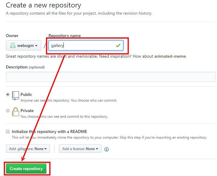
  2. 在本地端建立 \github\gallery
  3. 請依序執行(請從GitHub上複製執行)
    echo "# gallery" >> README.md
    git init
    git add README.md
    git commit -m "first commit"
    git remote add origin git@github.com:webugm/gallery.git
    git push -u origin master


  4. 完成後,請檢查 \github\gallery 與 GitHub 資料是否同步
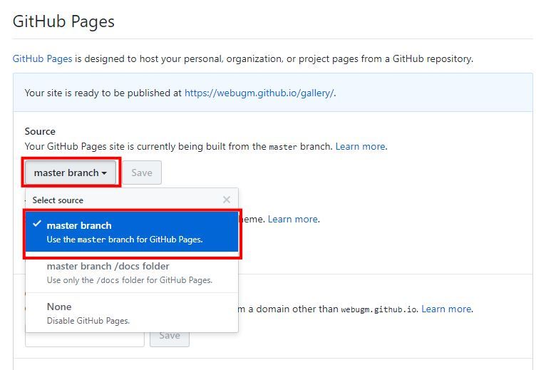
  5. 設定GitHub Pages
  6. 上傳三個步驟
    git add .
    git commit -m "訊息" 
    git push origin master
     

二、建立Bootstrap4框架

  1. 下載Bootstrap至我們的專案並解壓縮:https://github.com/twbs/bootstrap/releases/download/v4.1.0/bootstrap-4.1.0-dist.zip
  2. 下載JQuery:https://code.jquery.com/jquery-3.3.1.min.js
  3. 下載Popper:https://cdnjs.cloudflare.com/ajax/libs/popper.js/1.12.9/umd/popper.min.js
  4. Bootstrap4框架
    <!DOCTYPE html>
    <html lang="zh-Hant-TW">
      <head>
        <!-- Required meta tags -->
        <meta charset="utf-8">
        <meta name="viewport" content="width=device-width, initial-scale=1, shrink-to-fit=no">
     
        <!-- Bootstrap CSS -->
        <link rel="stylesheet" href="css/bootstrap.min.css">
        
        <!-- jQuery first, then Popper.js, then Bootstrap JS -->
        <script src="js/jquery-3.3.1.min.js"></script>
        <script src="js/popper.min.js"></script>
        <script src="js/bootstrap.min.js"></script>
     
        <title>Bootstrap 離線版</title>
      </head>
      <body>
     
      </body>
    </html>


  5. 建立index.html、電子相簿
  6. 檢查js、css引入是否有問題
  7. Bootstrap4 中文官網:http://bootstrap.hexschool.com/

三、建立電子相簿網格

  1. 容器:container(固定)、container-fluid(滿版)
  2. 斷點:xs、sm、md、lg
  3. 列:row
  4. 欄:col
  5. 圖片:.img-thumbnail 讓圖片有1px邊框的顯示、.img-fluid 設定為響應式

四、圖片處理

  1. 高清免費圖片:https://unsplash.com/
  2. 簡易圖片編輯軟體:http://www.faststone.org/ (批次處理)
  3. 框架
    
        <div class="container">
          <h1 class="my-4 text-center text-lg-left">電子相簿</h1>
          <div class="row">
            <div class="col-lg-3 col-md-4 col-sm-6">
              <a href="#" class="d-block mb-4 h-100">
                <img class="img-fluid img-thumbnail" src="...." alt="">
              </a>
            </div>
          </div>
        </div>


  4.  

五、電子相簿播放

  1. 相簿套件:https://github.com/sachinchoolur/lightGallery
  2. 線上範例:http://sachinchoolur.github.io/lightGallery/
  3. 可以先下載專案,再去看demo,即可了解套件
  4. 安裝
    
        <!-- lightgallery css -->
        <link rel="stylesheet" type="text/css" href="lightgallery/css/lightgallery.css">
        <!-- lightgallery js -->
        <script src="lightgallery/js/picturefill.min.js"></script>
        <script src="lightgallery/js/lightgallery-all.min.js"></script>
        <script src="lightgallery/js/jquery.mousewheel.min.js"></script>
        <script type="text/javascript">
          $(document).ready(function(){
              $('#lightgallery').lightGallery();
          });
        </script>


  5. 在包裝上「id="lightgallery"」,在項目上「data-src="...." data-sub-html="....."」
  6. https://github.com/tawan158/gallery

數位相簿很上手

7-1 上課範例

  1. 容器,架構
    
        <!-- 容器 -->
        <div class="container">
          <!-- 列 -->
          <div class="row">
            
            <!-- item -->
            <div class="col-lg-3 col-md-4 col-sm-6">
              <a href="#">
                <img src="...." alt="...">
              </a>          
            </div>
    
          </div>
        </div>


  2.  

數位相簿很上手

8. 建立電子相簿版型(二)

  1. https://github.com/tawan158/gallery

數位相簿很上手

8-1 css

  1. css盒子模式
  2. position
    描述
    absolute

    生成絕對定位的元素,相對於static 定位以外的第一個父元素進行定位。

    元素的位置通過"left", "top", "right" 以及"bottom" 屬性進行規定。

    fixed

    生成絕對定位的元素,相對於瀏覽器窗口進行定位。

    元素的位置通過"left", "top", "right" 以及"bottom" 屬性進行規定。

    relative

    生成相對定位的元素,相對於其正常位置進行定位。

    因此,"left:20" 會向元素的LEFT 位置添加20 像素。

    static默認值。 沒有定位,元素出現在正常的流中(忽略top, bottom, left, right 或者z-index 聲明)。
    inherit 規定應該從父元素繼承position 屬性的值。
  3. box-sizing:border-box、contant-box
    http://zh-tw.learnlayout.com/box-sizing.html

數位相簿很上手

8-2 播放圖示置中

  1. 範例:FB

    See the Pen 播放圖示置中 by ugm (@ugm) on CodePen.

     
  2. 上方的範例,由FB擷取而來,我們可以稍做變化,即可做成連結
    原始碼:https://github.com/webugm/bootstrap4/blob/master/position.html
    範例:https://webugm.github.io/bootstrap4/position.html

數位相簿很上手

8-3 上課練習

  1. http://sachinchoolur.github.io/lightGallery/ 
    滑鼠移至圖片時,會出現
  2. 試著利用這個範例,套到我們的電子相簿
    範例:https://webugm.github.io/gallery/gallery.html
    原始碼:https://github.com/webugm/gallery/blob/master/gallery.html

     
  3. https://github.com/tawan158/gallery/blob/master/20180619-1.html 
    https://tawan158.github.io/gallery/20180619-1.html
  4.  

數位相簿很上手

8-4 lightGallery 插件控制

  1. 帶動畫縮略圖的畫廊
    
              thumbnail:true  //true、false


  2. 沒有動畫縮略圖的畫廊
              
              thumbnail:true,
              animateThumb: true,        //略縮圖動畫
              showThumbByDefault: false  //預設出現略縮圖


  3. Youtube,Vimeo視頻庫
    在項目上,
    加「data-poster="......jpg"」
    「data-src="....."」,改成影片的網址
    不過必在伺服器,才能執行
    https://webugm.github.io/gallery/videos.html
  4. 播放圖示,修改
    圖示:play-button.png
              zoom.png
  5. 範例:
    https://github.com/webugm/gallery/blob/master/videos.html
    https://webugm.github.io/gallery/videos.html
  6.  

數位相簿很上手

8-5 總結

  1. 下載套件:https://github.com/webugm/gallery/raw/master/lightgallery.zip
  2. 安裝
      
        <!-- lightgallery css -->
        <link rel="stylesheet" type="text/css" href="lightgallery/css/lightgallery.min.css">
        <!-- lightgallery js -->
        <script src="lightgallery/js/picturefill.min.js"></script>
        <script src="lightgallery/js/lightgallery-all.min.js"></script>
        <script src="lightgallery/js/jquery.mousewheel.min.js"></script>
        <script type="text/javascript">
          $(document).ready(function(){
            $('#lightgallery').lightGallery();
          });
        </script>


  3. 在包裝增加 「id="lightgallery"」
  4. 在項目增加「data-src="img/img01.jpg" data-sub-html="<h4>標題1</h4><p>內容1</p>"」

數位相簿很上手

9. 上方選單

  1. 包裝:.navbar
  2. 響應式的折疊:.navbar-expand{-sm|-md|-lg|-xl} (576 - 768 - 992 -1200)
  3. 文字顏色:
    深色背景顏色:.navbar-dark
    淺色背景顏色:.navbar-light
  4. 背景顏色:使用通用類別
    .bg-primary
    .bg-secondary
    .bg-success
    .bg-danger
    .bg-warning
    .bg-info
    .bg-light
    .bg-dark
    .bg-white
  5. 使用.container、.container-fluid,留左右內距

數位相簿很上手

9-1 一般導覽列

  1. https://github.com/tawan158/gallery/blob/master/20180626.html
    原始碼
    
        <!-- 上方選單 -->
        <div class="header" id="header">
          <nav class="navbar navbar-expand-lg navbar-light bg-light">          
            <div class="container-fluid">
              <!-- 品牌 -->
              <a class="navbar-brand" href="#">Navbar</a>
              <!-- 切換按鈕 -->
              <button class="navbar-toggler" type="button" data-toggle="collapse" data-target="#navbarSupportedContent" aria-controls="navbarSupportedContent" aria-expanded="false" aria-label="Toggle navigation">
                <span class="navbar-toggler-icon"></span>
              </button>
              <!-- 下拉選單 -->
              <div class="collapse navbar-collapse" id="navbarSupportedContent">
                <ul class="navbar-nav mr-auto">
                  <li class="nav-item active">
                    <a class="nav-link" href="#">Home <span class="sr-only">(current)</span></a>
                  </li>
                  <li class="nav-item">
                    <a class="nav-link" href="#">Link</a>
                  </li>
                  <li class="nav-item dropdown">
                    <a class="nav-link dropdown-toggle" href="#" id="navbarDropdown" role="button" data-toggle="dropdown" aria-haspopup="true" aria-expanded="false">
                      Dropdown
                    </a>
                    <div class="dropdown-menu" aria-labelledby="navbarDropdown">
                      <a class="dropdown-item" href="#">Action</a>
                      <a class="dropdown-item" href="#">Another action</a>
                      <div class="dropdown-divider"></div>
                      <a class="dropdown-item" href="#">Something else here</a>
                    </div>
                  </li>
                  <li class="nav-item">
                    <a class="nav-link disabled" href="#">Disabled</a>
                  </li>
                </ul>
                <!-- 搜尋 -->
                <form class="form-inline my-2 my-lg-0">
                  <input class="form-control mr-sm-2" type="search" placeholder="Search" aria-label="Search">
                  <button class="btn btn-outline-success my-2 my-sm-0" type="submit">Search</button>
                </form>
              </div>
            </div>
          </nav>
        </div>    


  2.  

數位相簿很上手

9-2 多層下拉選單

一、套件

  1. 上課範例:https://github.com/tawan158/gallery/blob/master/20180626-1.html 
                      https://tawan158.github.io/gallery/20180626-1.html
  2. 網站:https://github.com/bootstrapthemesco/bootstrap-4-multi-dropdown-navbar
  3. DEMO:https://bootstrapthemes.co/demo/resource/bootstrap-4-multi-dropdown-navbar/
  4. 使用方法:
    引入插件
    
        <!-- 引入插件 bootstrap-4-multi-dropdown-navbar -->
        <link href="https://bootstrapthemes.co/demo/resource/bootstrap-4-multi-dropdown-navbar/css/bootstrap-4-navbar.css" rel="stylesheet">
        <script src="https://bootstrapthemes.co/demo/resource/bootstrap-4-multi-dropdown-navbar/js/bootstrap-4-navbar.js"></script>


  5.  


數位相簿很上手

10. 免費、付費樣板

  1. 在Google搜尋「bootstrap4 theme」
  2. 免費:https://startbootstrap.com/template-categories/all/
  3. 免費:https://mobirise.com/bootstrap-4-theme/ 製作響應式網頁的工具,說明:https://www.minwt.com/webdesign-dev/html/16758.html
  4. 付費:https://wrapbootstrap.com/
    https://htmlstream.com/preview/unify-v2.5.1/one-pages/photography/index.html

數位相簿很上手

11. unitegallery

  1. https://webugm.github.io/gallery/unitegallery.html
  2. https://github.com/tawan158/gallery/blob/master/20180628.html
  3. https://tawan158.github.io/gallery/20180628.html

一、方法

  1. 網格
     <!-- unitegallery -->
        <script type='text/javascript' src='unitegallery/js/unitegallery.min.js'></script>
        <link rel='stylesheet' href='unitegallery/css/unite-gallery.css' type='text/css' />
        <!-- 網格 -->
        <script type='text/javascript' src='unitegallery/themes/tilesgrid/ug-theme-tilesgrid.js'></script>
    
        <script type="text/javascript">
    
          jQuery(document).ready(function(){
    
            jQuery("#gallery").unitegallery();
    
          });
          
        </script>


  2.  

數位相簿很上手

12. 成果展

https://hackmd.io/GKPsaE76SuGzcyIgNnUuVQ

數位相簿很上手

12-1 unitegallery

  1. 說明:https://hackmd.io/s/ryxQ0E_GQ

數位相簿很上手

13. 雲端應用研究社-3

  1. CSS:http://www.w3school.com.cn/

數位相簿很上手

14. 雲端應用研究社-4

  1. https://www.ugm.com.tw/modules/tad_book3/index.php?op=list_docs&tbsn=60
  2. https://www.7-zip.org/


數位相簿很上手

15. 雲端應用研究社-5

  1. 免費樣板:https://startbootstrap.com/template-categories/all/
  2. 付費樣板:https://wrapbootstrap.com/
  3. 建立GitHub Pages方法:
  4. https://webugm.github.io/petanque2017/
  5. 網頁全端快速開發:http://ccs.tncomu.tw/modules/ccs_course/index.php?op=view_course&course_sn=7206
  6. Google雲端無紙化工作術:http://ccs.tncomu.tw/modules/ccs_course/index.php?op=view_course&course_sn=7198

數位相簿很上手

16. 雲端應用研究社-6-卡片的應用

一、利用網格

  1. 包裝
    
        <div class="container">
          <div class="row">
            <div class="col-sm-12 col-md-6 col-lg-4 col-xl-3">
              .....
            </div>
          </div>
        </div>


  2. 卡片
    
              <!-- card item -->
              <div class="card">
                <img class="card-img-top" src="...." alt="Card image cap">
                <div class="card-body">
                  <h5 class="card-title">card 標題</h5>
                  <p class="card-text">card 內容</p>
                  <a href="#" class="btn btn-primary">按鈕</a>
                </div>            
                <div class="card-footer">
                  <span>card 頁尾</span>
                </div>
              </div>
              <!-- card item end-->

    上課範例:https://github.com/tawan158/gallery/blob/master/20180607.html

  3. 範例
    https://elainehouse.github.io/elainehouse/
  4. 申請Gitlab
    https://gitlab.com/
  5. 設定 Gitlab pages 
    https://ithelp.ithome.com.tw/articles/10197791
  6. 如果帳號與 GitHub帳號不一致
    可以設定 local
    git config --local user.name "帳號"
    git config --local user.email "email"

二、線上筆記

  1. https://hackmd.io/
  2. https://hackmd.io/s/HkSYocLeQ
  3. https://hackmd.io/YgqdgHZJQgyMT-mSC0_Ctg


數位相簿很上手

17. git 更新

#Git 再次出現嚴重漏洞,只要透過 git clone 複製到惡意的遠端儲存庫,就會在本機電腦執行任意程式碼,相當危險,必須立刻更新所有 Git 用戶端軟體 (#所有作業系統平台)!  目前 #GitHub 與 #VSTS 都已經做出主動防禦,但其他平台很難說,#建議盡速更新,也請大家幫忙轉發,讓更多人知道

目前已修正的 Git 版本為 2.17.1、2.16.4、2.15.2、2.14.4 以及 2.13.7 等等,請大家盡速更新!
.
各作業系統平台的更新方法整理如下:

#Windows更新方法

git update-git-for-windows

choco upgrade git

#macOS更新方法

brew upgrade git

#Linux更新方法 (Ubuntu)

sudo apt update && sudo apt upgrade git

sudo apt-add-repository ppa:git-core/ppa
sudo apt update && sudo apt upgrade git

#FreeBSD更新方法

port selfupdate; port upgrade git

#最後記得用以下命令檢查Git版本號

git version

----

#攻擊示範影片:
https://twitter.com/VSTS/status/1001544001881862145

#詳細攻擊方法可以參考附件連結